Project Description
An embodiment of communal diversity and adaptability
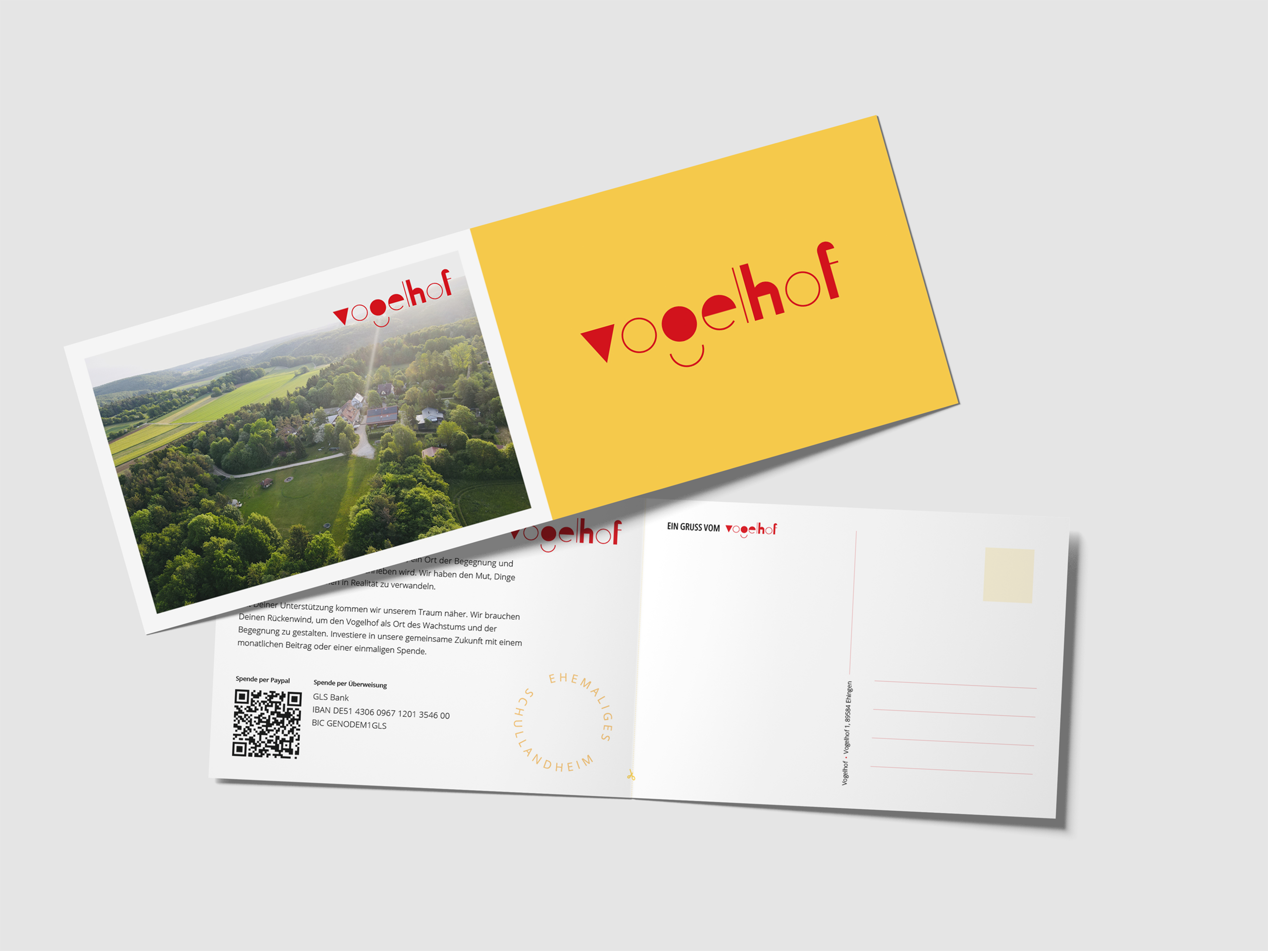
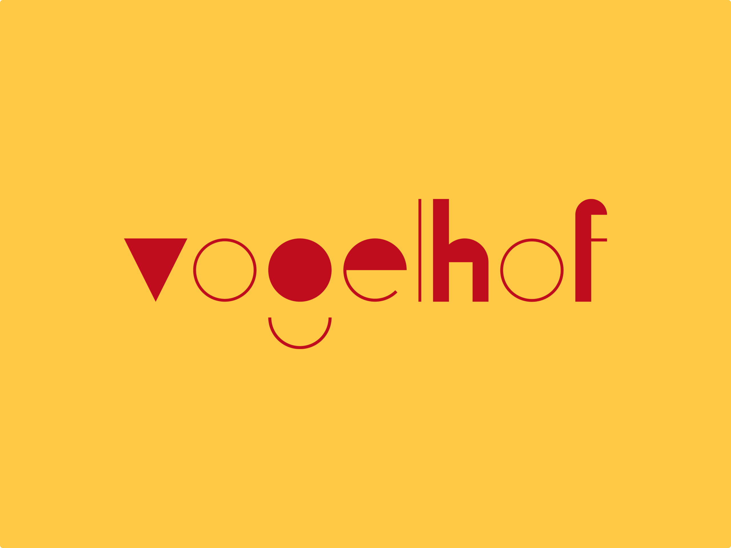
The logo of Vogelhof is more than a wordmark made of geometric shapes – it is a powerful symbol that embodies the essence of its community and vision. Each element, every triangle, circle, and stroke is carefully selected to reflect the diversity of its members and their skills.
The playfulness of the design resembles a construction kit, symbolizing unity and creativity. Just like Vogelhof itself, serving as a space for knowledge exchange and collaborative projects, the logo allows for a variety of interpretations and adaptations.


The colors represent joy, freshness, and professionalism. They characterize the brand and are an integral part of the logo and all elements where Vogelhof branding is used.


